

Standing in front of the mirror unsure whether two pieces “go together” is a feeling almost everyone knows. The fit might be right, the occasion might be clear, and yet something about the combination just feels off. More often than not, the culprit isn’t the clothing itself — it’s the way the colors relate to one another. Color is the quiet force that makes an outfit feel pulled together or vaguely awkward, even when you can’t put your finger on why.
The good news is that color coordination follows patterns you can learn, and those patterns are far simpler than they sound. You don’t need an art degree or an expensive consultation to understand which shades flatter each other and which ones fight. This guide breaks color matching down into approachable rules, explains the basic theory behind them, and gives you practical ways to build combinations you can trust — so getting dressed becomes a decision you make with confidence instead of guesswork.
Why Color Coordination Matters More Than You Think
Two people can wear the exact same silhouette and look completely different, and color is usually the reason. A well-matched palette signals intention; it tells the eye that everything belongs together. A clashing one does the opposite, pulling attention to the disconnect rather than to you. Because we register color before we process shape or detail, it’s the first thing anyone notices about an outfit.
Coordinating color also makes your wardrobe work harder. When your pieces share a sensible relationship, they combine into many more outfits than a random assortment of shades ever could. Understanding a few simple principles means you stop buying items that only match one thing, and start building a closet where almost everything plays well together.
The Color Wheel, Made Simple
Almost every coordination rule traces back to one tool: the color wheel. It arranges colors in a circle so you can see how they relate. You don’t need to memorize it, but understanding three categories makes everything else click into place:
- Primary colors — red, blue, and yellow, the building blocks that can’t be mixed from others.
- Secondary colors — green, orange, and purple, each made by blending two primaries.
- Tertiary colors — the in-between shades like teal or coral that come from mixing a primary with a neighboring secondary.
The key insight is position. Colors sitting next to each other on the wheel feel harmonious and calm, while colors sitting opposite each other create energy and contrast. Once you can picture roughly where a shade lives on that circle, the rules below become intuitive rather than abstract.
It also helps to know that color isn’t just hue. Every shade has a saturation — how vivid or muted it is — and a brightness, from light to dark. Two colors that technically “match” on the wheel can still feel off if one is a soft pastel and the other a loud, fully saturated tone. As a rule of thumb, pairing colors that share a similar level of intensity keeps an outfit balanced, while a deliberate jump in brightness can create a focal point exactly where you want one.
Three Reliable Color Schemes
Designers lean on a handful of proven combinations, and three of them cover the vast majority of everyday outfits. Each produces a different mood, so the right choice depends on the feeling you’re after:
- Complementary — two colors directly across from each other, such as blue and orange. This is the boldest, highest-contrast option and works best when one color leads and the other accents.
- Analogous — three colors sitting side by side, like blue, teal, and green. These feel naturally cohesive and relaxed, ideal for a soft, blended look.
- Monochromatic — a single color explored in different shades and tints, from pale to deep. It reads as elegant and effortless because there’s no risk of a clash.
A useful habit is to let one color dominate, give a second a supporting role, and reserve a third for small touches. This rough balance keeps any scheme from feeling chaotic, no matter how adventurous the colors themselves are.
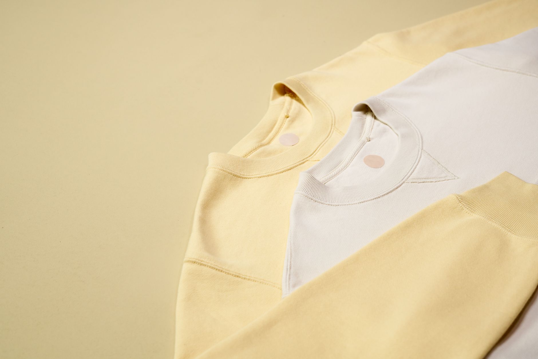
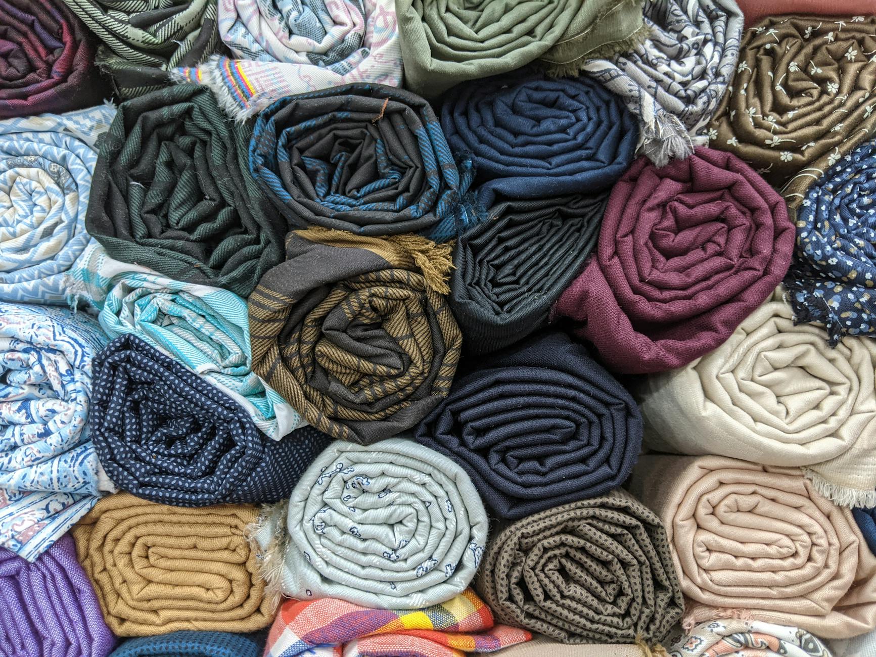
The Quiet Power of Neutrals
Before you worry about bold pairings, it helps to appreciate the colors that match nearly everything. Neutrals — black, white, gray, beige, navy, and earthy browns — are the connective tissue of any wardrobe. They calm down brighter pieces, anchor busy patterns, and rescue combinations that would otherwise feel like too much.
A practical approach is to build the bulk of an outfit on neutrals and add color deliberately. A neutral base means you can introduce one vivid piece and instantly look coordinated, because the rest of the outfit isn’t competing for attention. Neutrals also stretch your options dramatically: a single pair of beige trousers will partner happily with almost any top in your closet, which is exactly why versatile basics tend to be neutral.
Understanding Undertones and Warmth
Two shades of the same color can still clash, and undertones explain why. Every color carries a hidden lean toward warm or cool. Warm tones contain hints of yellow, red, or gold; cool tones lean toward blue, green, or violet. A warm cream and a cool stark white may both read as “white,” yet placing them together can look slightly mismatched.
You don’t need to analyze every garment scientifically, but a couple of guidelines go a long way:
- Group warm with warm and cool with cool for the most seamless result, especially in pieces worn close together.
- Mix warm and cool intentionally when you want contrast, treating the difference as a feature rather than an accident.
- Let metals follow undertone — gold accents tend to complement warm palettes, while silver suits cooler ones.
Undertones also matter against your skin. Holding a color near your face and noticing whether it makes you look bright and rested or washed out is the simplest test there is. The shades that flatter you most are worth keeping near the front of your wardrobe.
Putting the Rules Into Practice
Theory only helps if it survives contact with a real closet, so here are the moves that make color coordination second nature day to day:
- Start from one anchor piece and build outward, choosing each addition based on how it relates to that first color.
- Repeat a color for cohesion — echoing a shade from your top in a small accessory makes an outfit feel deliberate.
- Limit the palette to three colors in a single look until you’re comfortable; restraint almost always reads as polished.
- Use prints as a shortcut — a patterned piece already contains a tested palette, so pull a plain color directly from it for the rest of the outfit.
- Check your look in natural light whenever possible, since indoor lighting can hide a clash you’ll notice outside.
It also pays to practice in low-stakes ways. Lay out a few combinations on your bed before a busy morning, photograph the ones you like, and keep them as a personal reference. Over time you’ll notice which pairings you return to and which never quite work, and that growing instinct is more valuable than any single rule. Color confidence is built through small experiments, not memorized formulas.
None of these rules are unbreakable. Once you understand why certain colors work together, you’ll know when bending a guideline creates something striking rather than messy. The patterns are a foundation, not a cage.
Frequently Asked Questions
Can I wear black and navy together?
Yes, though it takes a little care. The two are easy to confuse in dim light, so the combination works best when the contrast is intentional and a third element — a belt, shoes, or a lighter layer — separates them clearly.
How many colors should one outfit have?
Three is a safe and flattering ceiling for most looks: one dominant color, one supporting color, and one accent. Fewer can feel sleek, while more than three demands a careful eye to avoid looking busy.
Do I have to match my accessories exactly?
No. Exact matching can look stiff. It’s often more interesting to coordinate rather than match — pick accessory colors that echo or complement your outfit instead of replicating one shade precisely.
What if I love a color that doesn’t suit me?
Wear it away from your face, where undertones matter less — think shoes, a bag, or bottoms. That way you enjoy the color you love without it drawing attention to a clash with your complexion.
The Takeaway
Color coordination isn’t a mysterious talent reserved for stylists — it’s a small set of patterns anyone can learn. Once you grasp how colors sit on the wheel, lean on neutrals as a steady base, and pay attention to warm and cool undertones, mixing and matching stops feeling like a gamble. Start with one anchor color, keep your palette tight, and trust the simple rules until they become instinct. Do that, and you’ll find that the outfits you reach for look more intentional, more flattering, and far easier to assemble than they ever did before.